Patina – by definition – is a film or incrustation, usually green, produced by oxidation on the surface of old bronze and often esteemed as being of ornamental value. I have always loved those “fake” patinas that artists create. I was so excited when I saw that learning to create a patina look was one of the “projects” in the year-long workshop I am doing online of Julia Andrus’s Paper Transformed.
Unfortunately, my acrylic selection/collection is not all that wide. It consists of three tubes of color – turquoise, green and crimson, a tube of pearlescent tint and a collection of craft acrylics that have been used to paint Pinewood Derby cars over the years – which means black, blue, yellow, cream … not a very good combination.
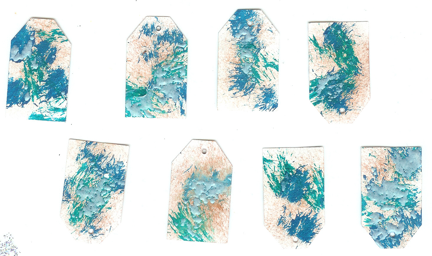
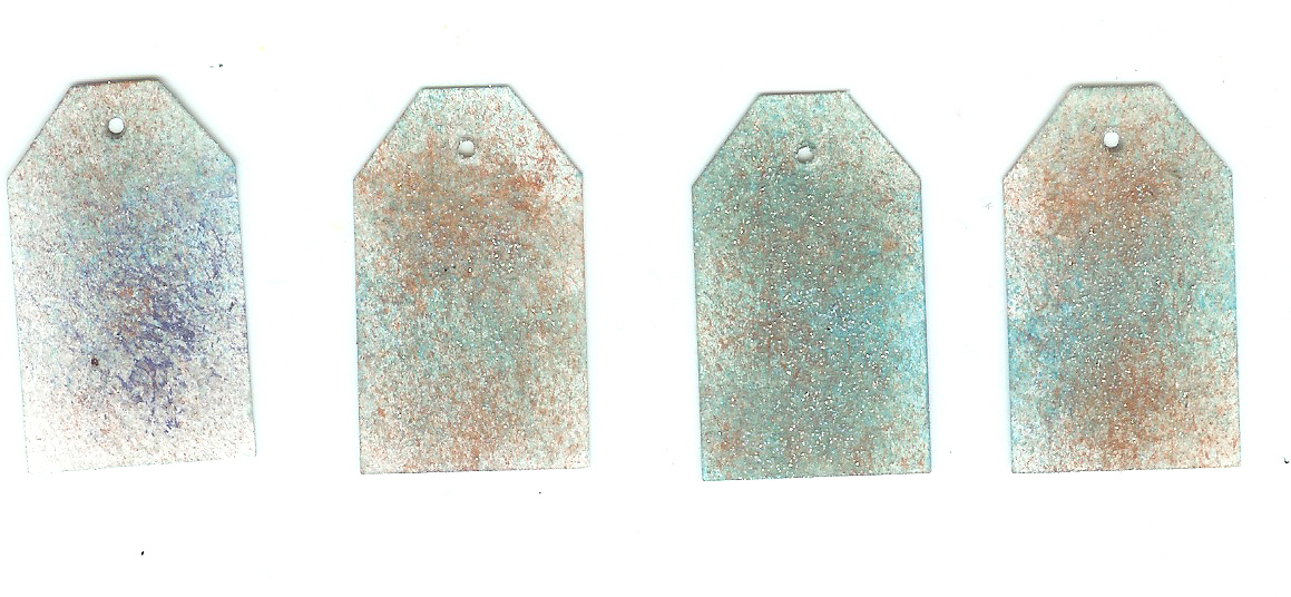
My stamp pad collection, though, includes copper and many different greens and blues so off I went to make some patinad – is that even a word? – tags. My first attempt was with stamp pads. I first put a stippled layer of Cosmic Copper Brilliance on both sides of the tag. Then, I stippled in some different colored Fresco chalk inks – formerly from Stampa Rosa so you know these are old. I used Giovanni’s Garden, Velvet Indigo and Blue Grotto. I also embossed the entire tag with an irridescent embossing powder from Stampin’ Up!
I really wanted to try doing patina with acrylics. I sat down with what I have and started mixing to see if I could get the colorings I wanted. I, again, stippled the entire tag with Cosmic Copper Brilliance ink. The I used a mixture from the green and the turquoise with pearlescent tint and craft acrylics to get a different tone of the color. I decided I wasn’t sure I liked the look so I then took UTEE (ultra thick embossing enamel) in interference green – don’t ask as I don’t remember why I have this – and put some on each tag where the acrylics were still wet enough for sticking.